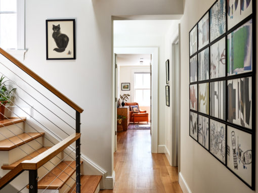
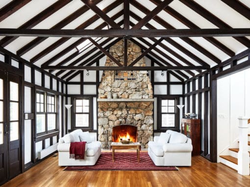
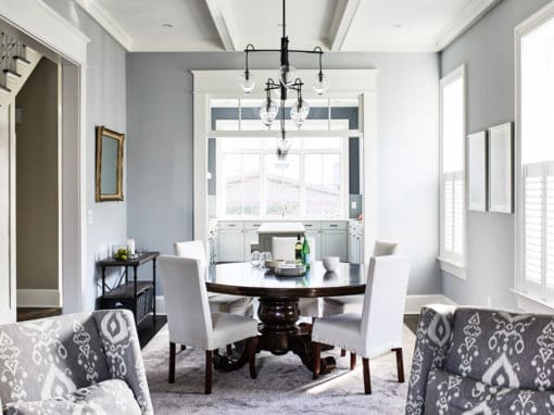
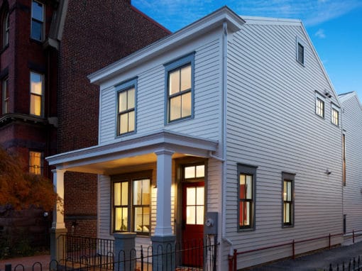
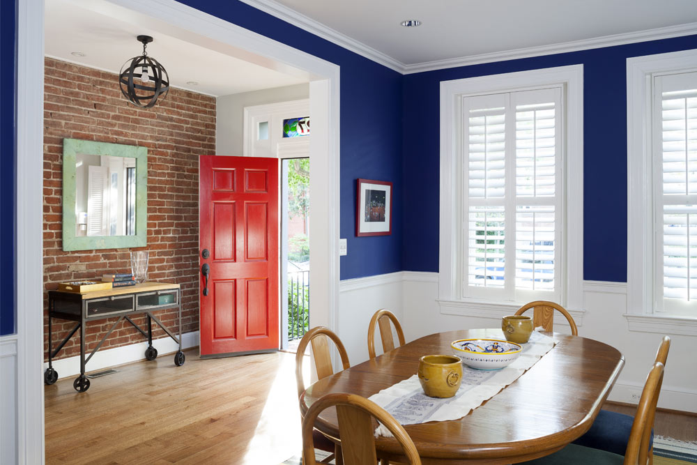
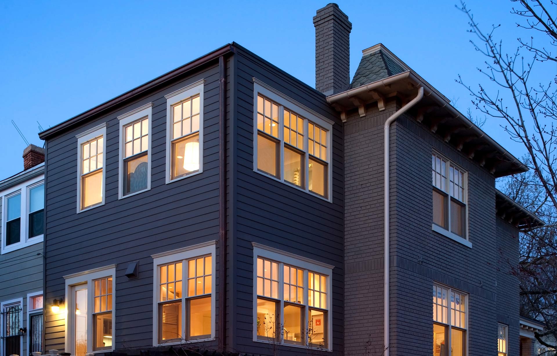
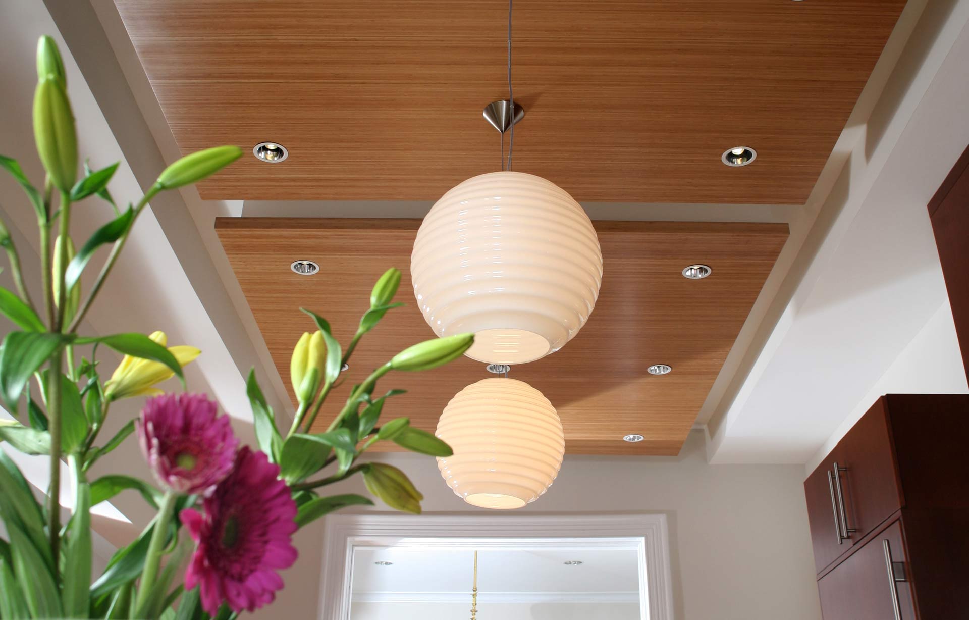
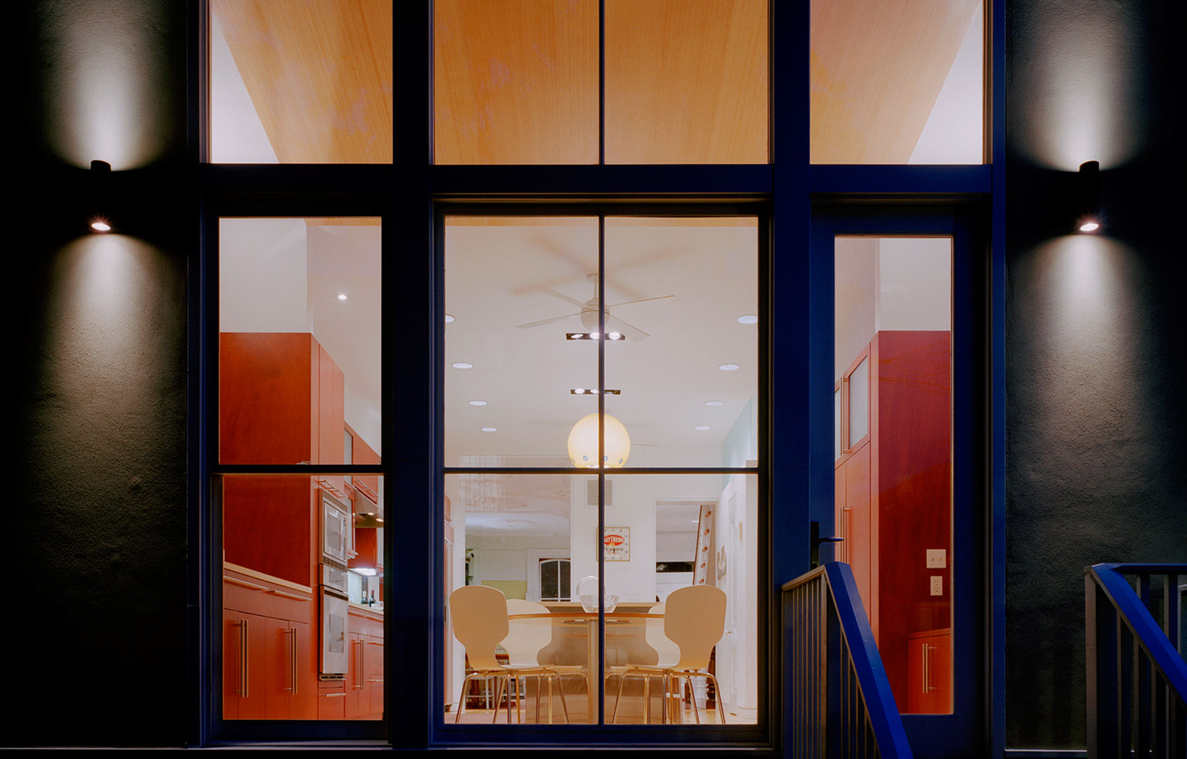
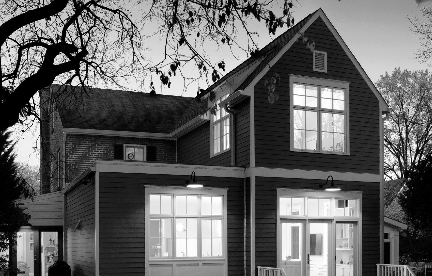
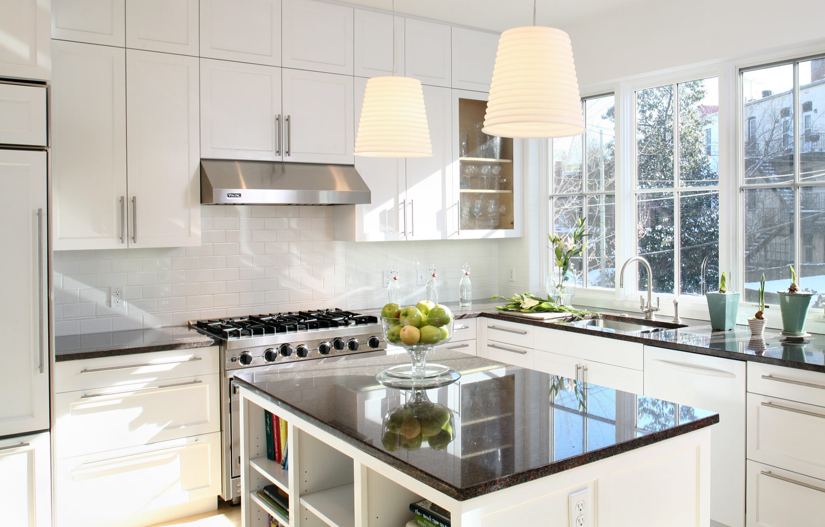
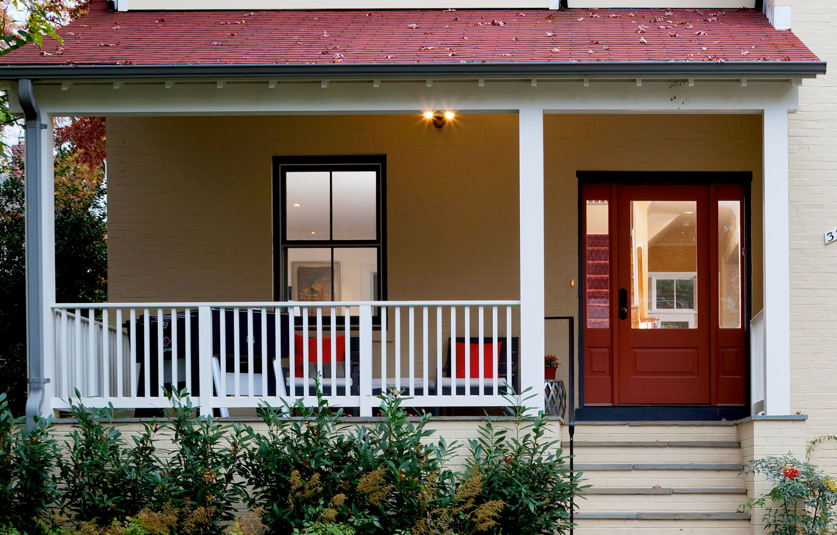
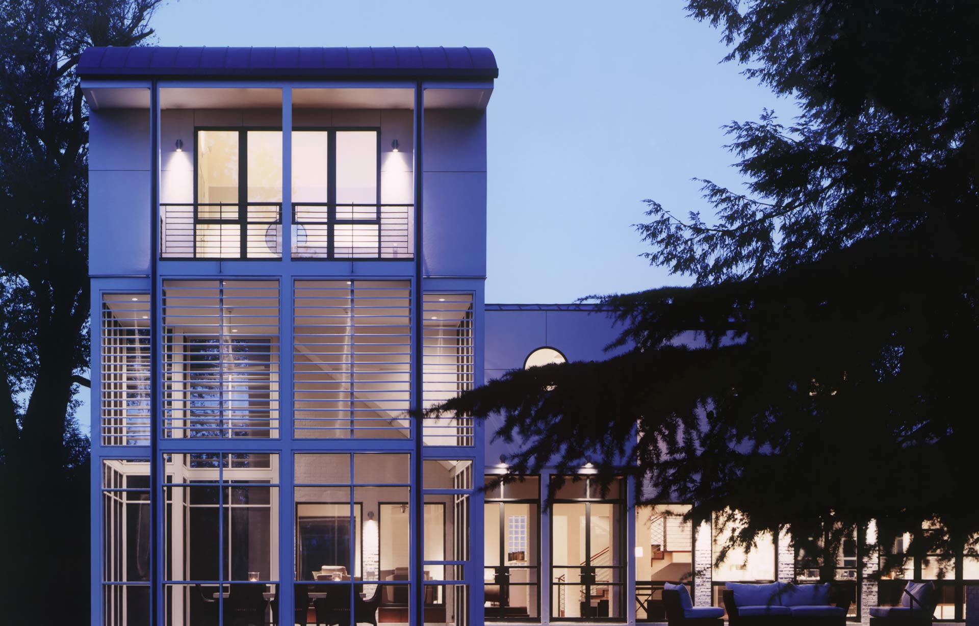
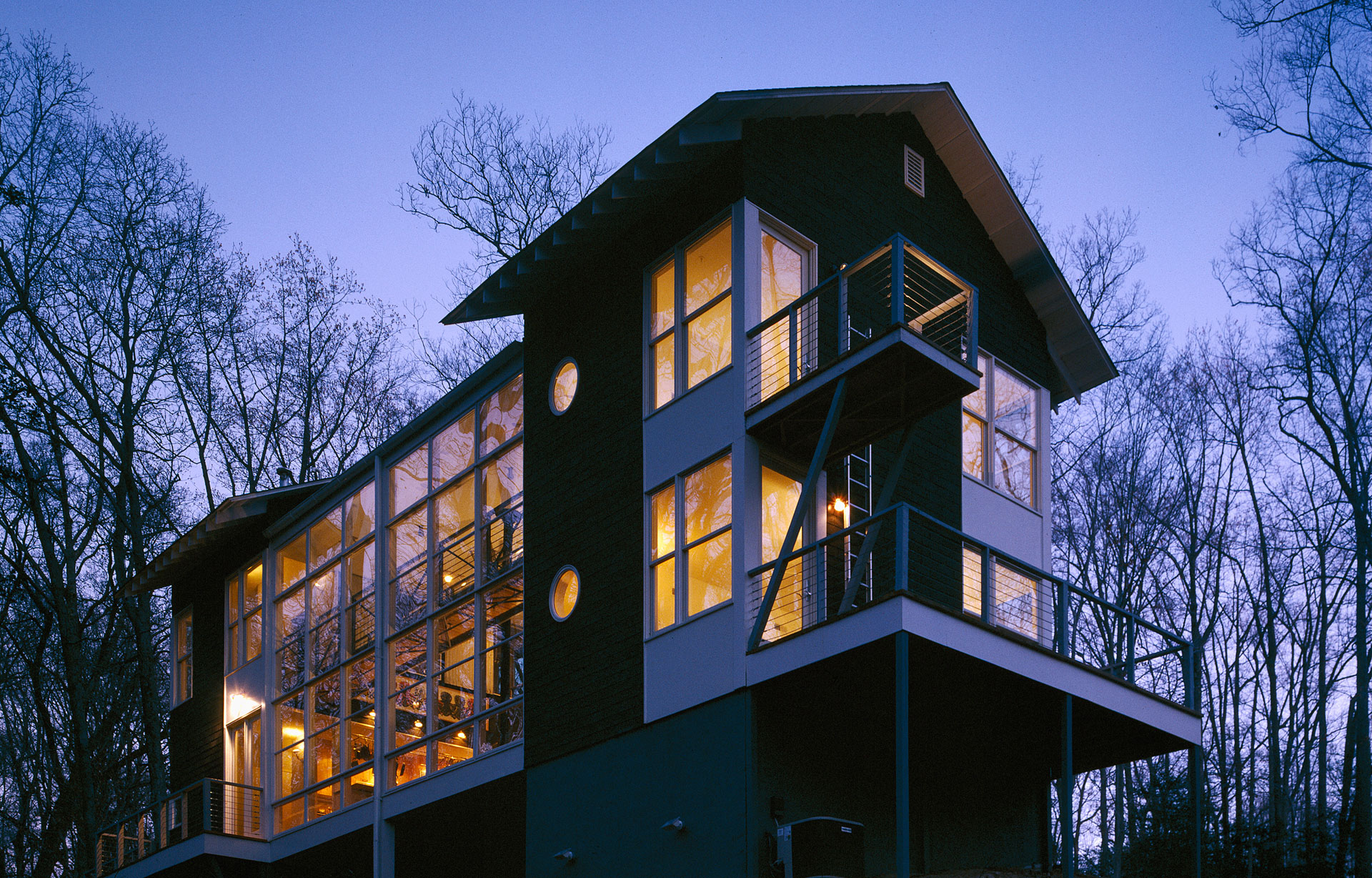
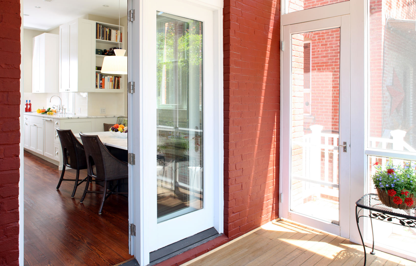
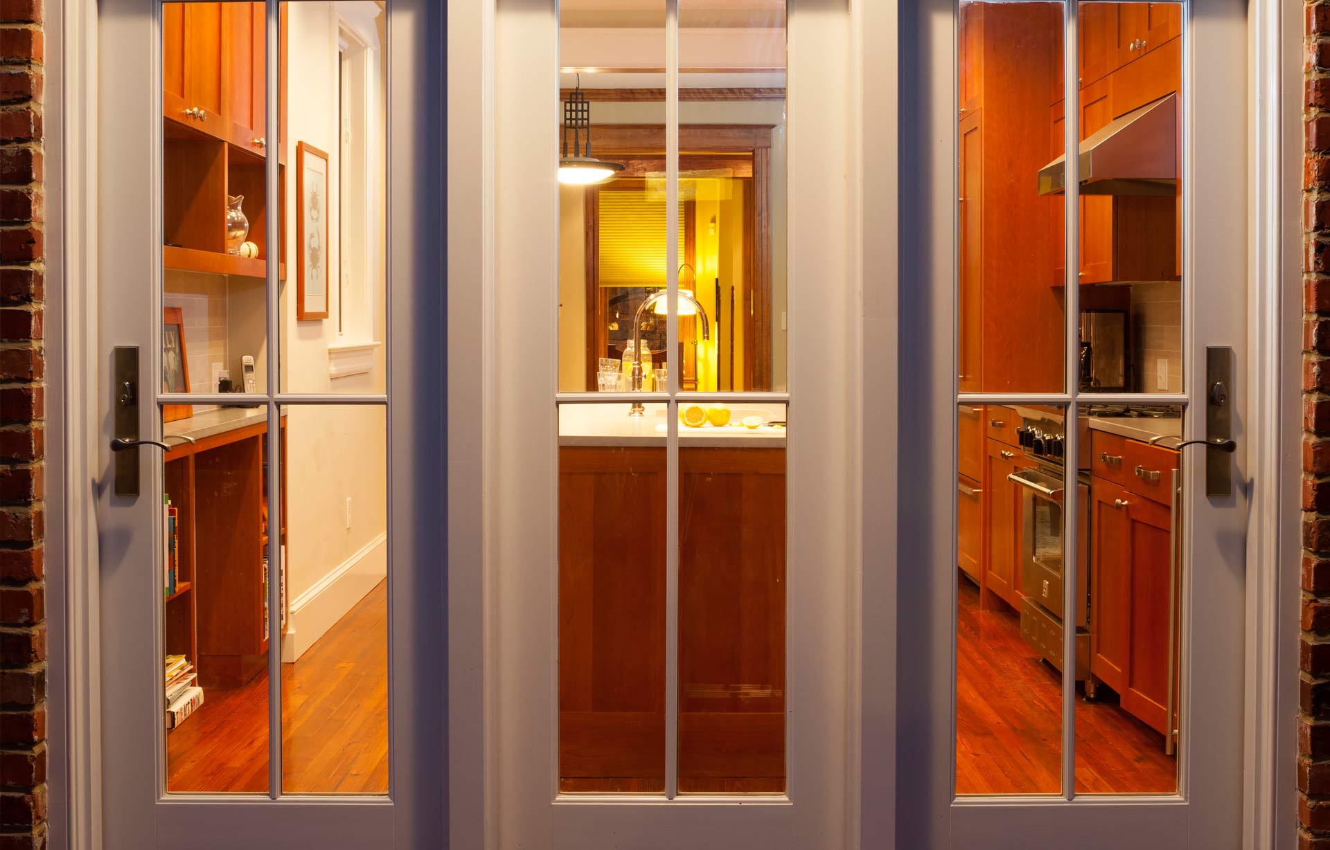
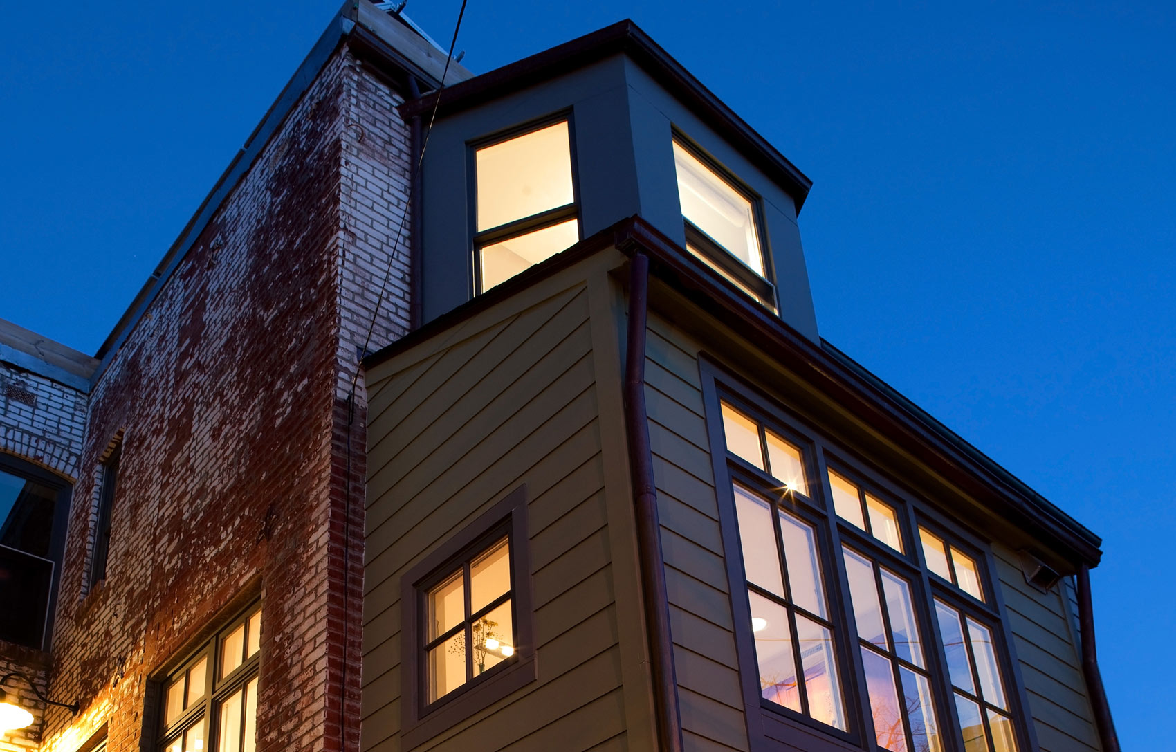
What makes an 1860’s historic, wooden house feel new and modern? That’s the question these clients asked themselves now that their adult children had moved out and they contemplated a fresh start. They loved their house and location but felt like the spaces weren’t working for them anymore. With their deep appreciation for mid-20th century design, we launched a careful campaign to reimagine the 1st floor this classic, framed house. We decided to preserve many of the house’s original details as they were still in excellent condition. We then contrasted them with more contemporary design elements sequentially introduced as you move through the house towards the garden. All the openings between the rooms were expanded to allow the natural light to blend with the interiors and to create visual connections between all spaces. New casings were custom made to match the elaborate period trim.
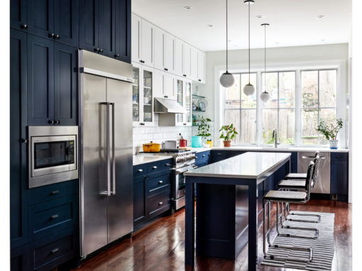
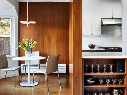
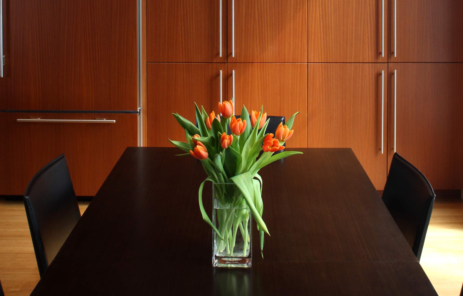
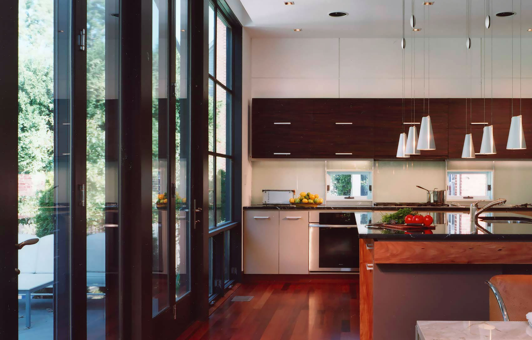
The back of the house contains the spaces that are the greatest departure from the house’s origins. Smooth book-matched, walnut cabinets and paneling are arrayed to create the kitchen, family room, bar and breakfast spaces while also containing the steel structure.
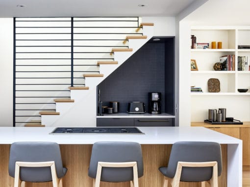
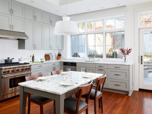
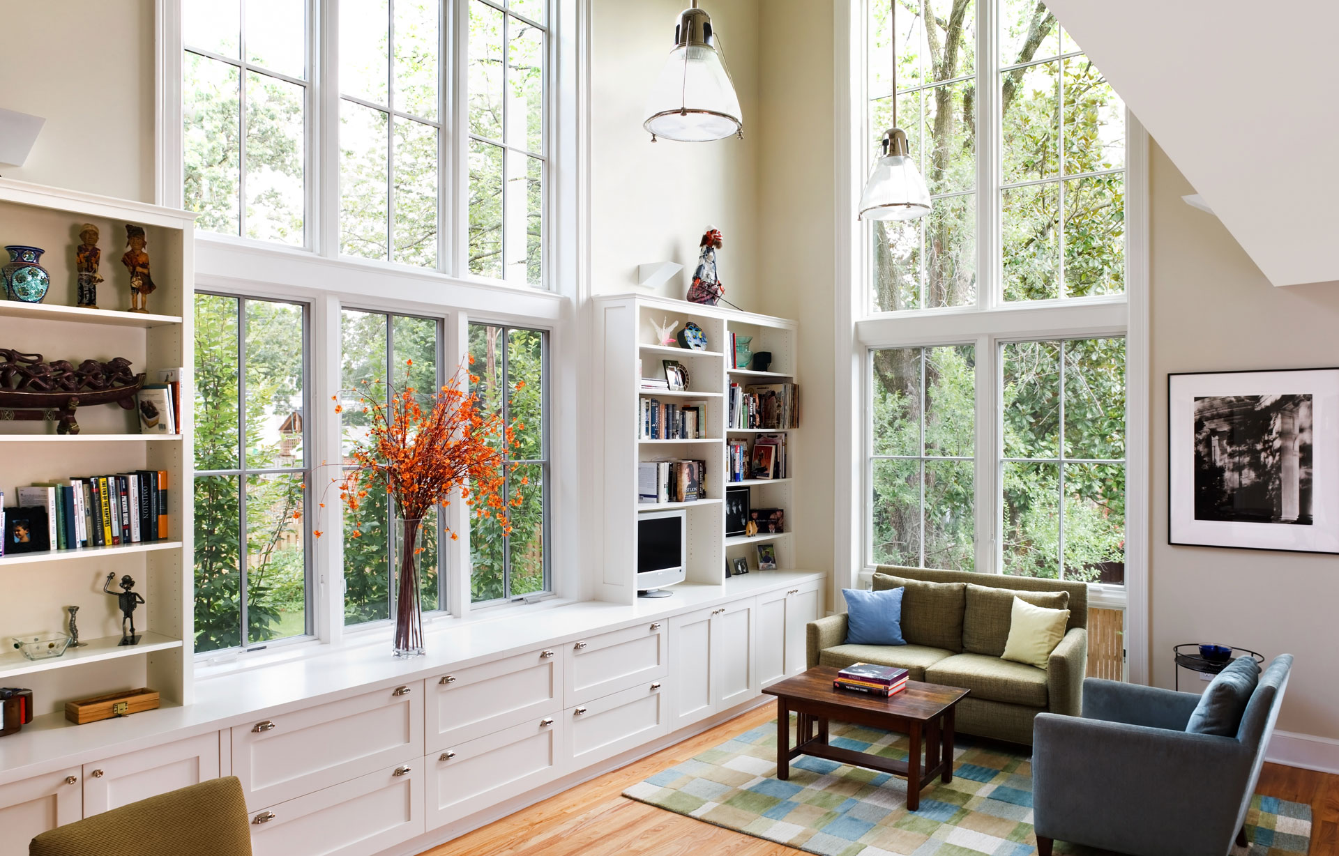
The kitchen has large openings as a visual connection to the family room but has a floating center wall to provide some screening while cooking and cleaning. This same wall serves double duty with a TV incorporated to the opposite side facing the family room along with bar equipment and cabinets. A large sweep of open bookcases and cabinets form the backdrop of the room and a niche for the sofa and seating group.
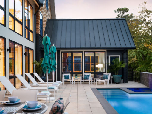
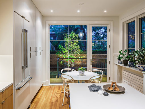
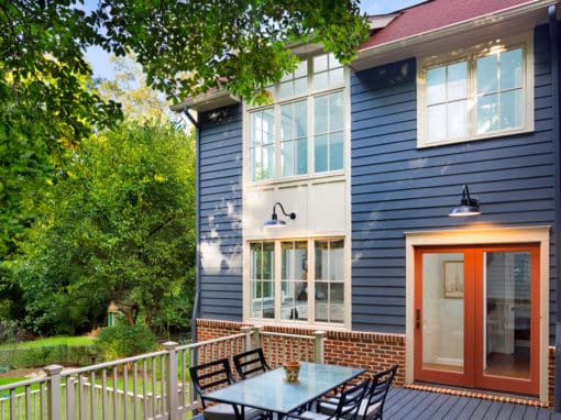
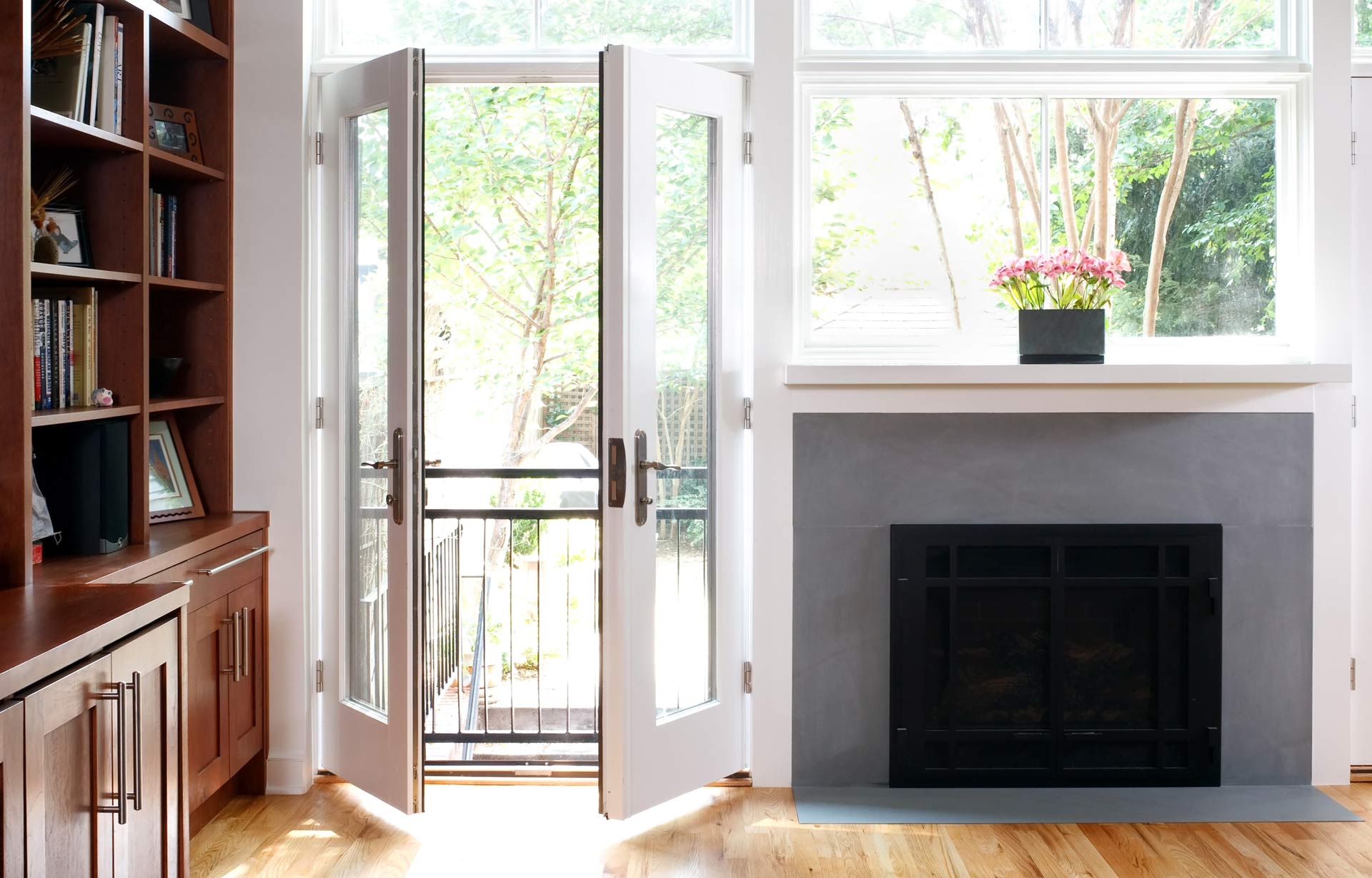
The garden becomes the fourth wall of the room with new window wall incorporating the private landscape. All new lighting and finishes prepare this house for its next chapter.
